H2O Divers Dahab is a premier Dive Center. Not only is their passion inspiring, but they also work hard to maintain the highest standards, top-notch facilities, and an awesome staff.
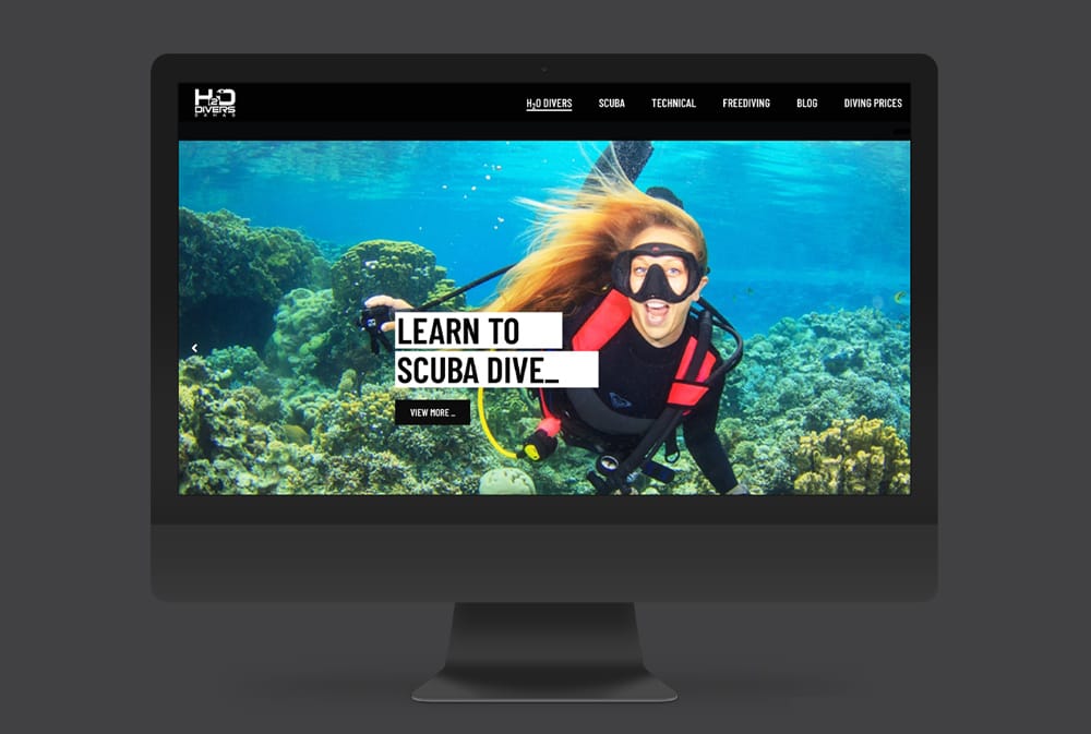
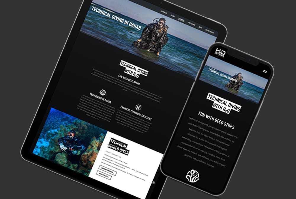
Despite their attention to detail in diving humbling me, their website was in need of a revamp. Over the years, their website had grown without control of layout, style, and structure. It was time to simplify the framework, get to the point, and provide their customers with proper, clear, and fast access to the information they want and need.
H2O's new website is strong, bold, and direct. It is stripped and deconstructed, with a black design that is raw in its focus on content, prioritizing what the visitor will want to know and find.
#0a0c0c
#333333
#6d6f70
#ffffff


Direct, straightforward. The website is exactly who we are - no bullshit, just diving. And of course, black. Black is the best.
- Alex Heyes, Managing Partner at H2O Divers Dahab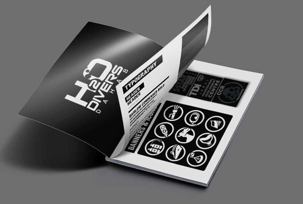
Alex would like to have a tee for every weird and wonderful diving thing that she love. As a scuba diver myself, I'm so happy that she let me have free creativity to put on a t-shirt a design that I also really want to wear.
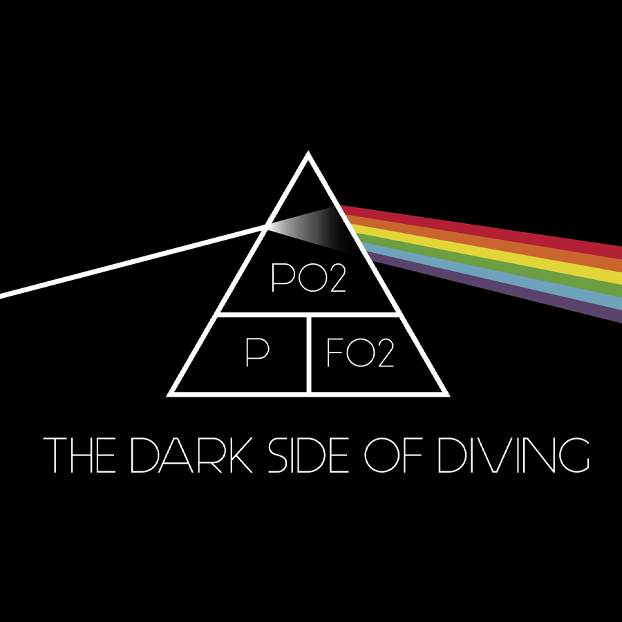
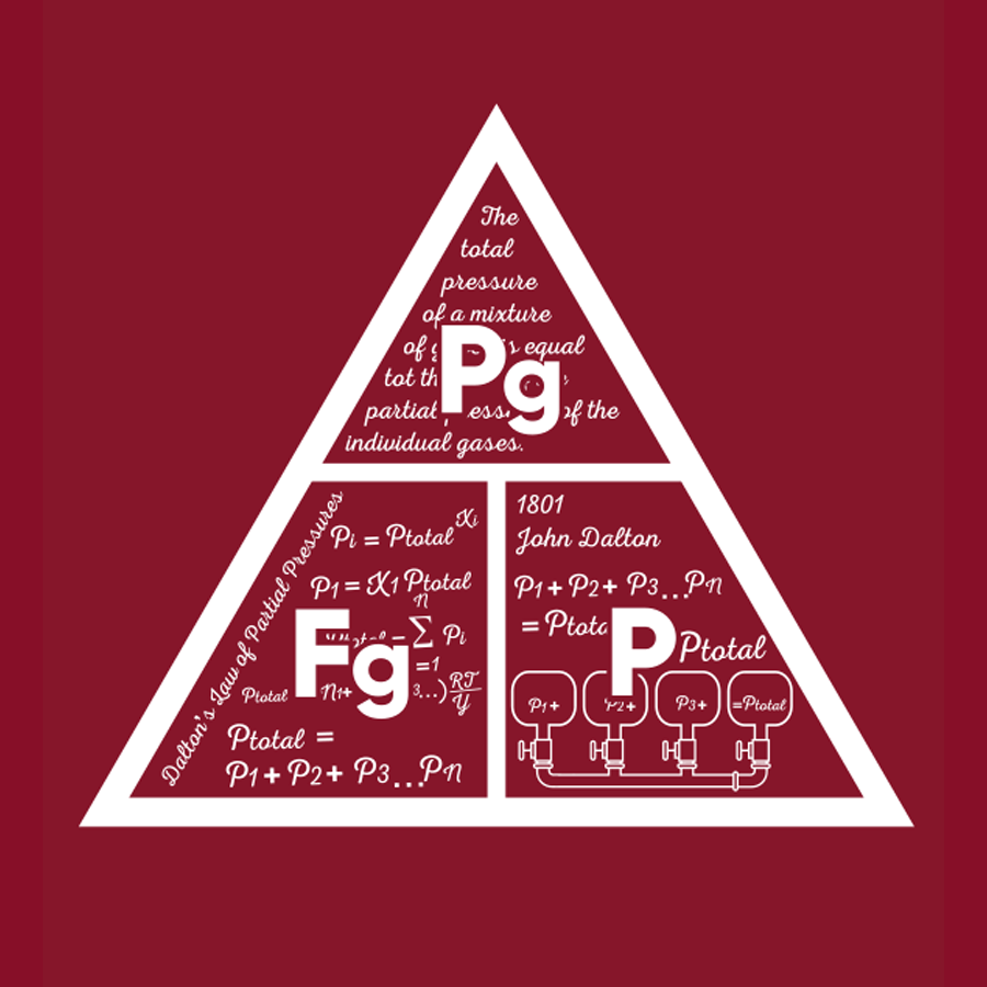
The H2O website has a sleek design, but it also incorporates some brutalist techniques, which may not be the most attractive feature for clothing. Instead, H2O t-shirts take a more nostalgic approach. They feature throwback retro designs illustrating the dive center's house reef and some of the most famous physics formulas that all tech divers are proud to know.

