
I first worked with Blue Ocean Freedivers in 2014, and since then, Brian and Catherine have become established figures in the international freediving community. As their influence grew, it was time for the brand to evolve too.
Freediving is often presented as extreme, but they take a different approach. More calm, focused and deeply committed to quality teaching. The challenge was to reflect that in a more contemporary identity without losing the personality that sets them apart.
VISUAL IDENTITY
LOGO
WEB
PHOTOGRAPHY
#83bfe8
#046199
#1B2844
#fcb334
#13c2c5
" height="93.70000000000002px" id="hVRvLpirX" width="93.6000015258789px"/><path d="M 15.962 3.083 C 15.962 2.283 16.262 0.283 15.862 0.083 C 15.262 -0.117 14.662 0.083 14.162 0.283 C 13.562 0.483 13.362 0.583 12.362 0.983 L 12.162 0.983 C 8.862 2.183 6.662 4.483 5.362 7.683 C 5.162 8.083 4.862 8.583 4.462 8.783 C 1.862 10.083 0.862 12.383 0.962 14.983 C 0.962 17.583 1.362 20.183 1.662 22.783 C 1.862 24.983 1.862 27.183 2.062 29.283 C 2.262 31.283 2.662 33.183 2.962 35.183 C 2.962 35.583 3.262 36.083 3.262 36.483 C 3.562 39.083 4.162 41.583 5.862 43.683 C 6.662 44.683 6.362 45.883 5.862 46.883 C 4.062 50.283 4.262 53.983 3.462 57.583 C 3.262 58.583 3.762 59.783 3.962 60.983 C 2.662 60.383 2.262 61.183 1.762 62.183 C 1.462 62.683 1.162 63.183 0.762 63.683 C -0.338 65.483 -0.338 67.183 1.362 68.483 C 3.262 69.883 3.662 71.183 3.262 73.483 C 2.762 75.883 3.262 78.383 3.362 80.883 C 3.362 81.883 3.262 82.883 2.862 83.883 C 2.662 84.483 2.162 85.083 1.862 85.683 C 1.662 86.083 1.062 87.083 1.462 87.583 C 1.962 88.183 3.262 86.183 3.462 85.883 C 4.762 83.883 5.062 81.583 5.262 79.183 C 5.362 77.483 5.562 75.783 5.662 73.983 C 5.862 71.683 6.662 69.583 7.962 67.683 C 9.962 64.783 10.662 61.583 10.662 58.183 C 10.662 56.283 10.662 54.383 10.862 52.583 C 10.862 50.783 11.662 49.283 12.662 47.783 C 14.862 44.483 14.562 40.983 11.862 38.083 C 10.762 36.883 9.662 35.783 8.562 34.583 C 7.162 32.983 6.162 31.283 6.762 28.883 C 7.262 26.783 6.562 24.683 5.662 22.783 C 5.262 21.883 4.762 21.083 4.262 20.183 C 3.962 19.683 3.862 19.283 4.162 18.583 C 4.462 17.683 4.362 16.683 4.362 15.683 C 4.162 13.283 5.162 11.583 7.462 10.883 C 9.162 10.383 10.862 10.083 12.662 9.783 C 16.662 8.983 15.862 9.583 15.962 5.983 C 15.962 4.983 15.962 3.983 16.062 2.983 Z" fill="rgb(131, 191, 232)" height="87.69447388494719px" id="x9wVyZ7r9" transform="translate(40.138 3.917)" width="16.07014744405646px"/></g></svg>)

Full Crest
Glyph
The new logo pairs a minimalist freediver symbol with fluid, hand-drawn lettering that reflects the calm, effortless movement of being underwater. The result is a clean, understated identity that captures the peaceful essence of freediving while retaining a human touch.
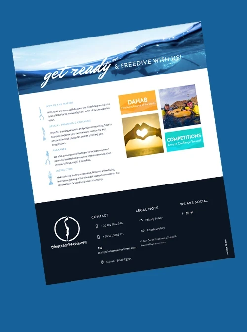
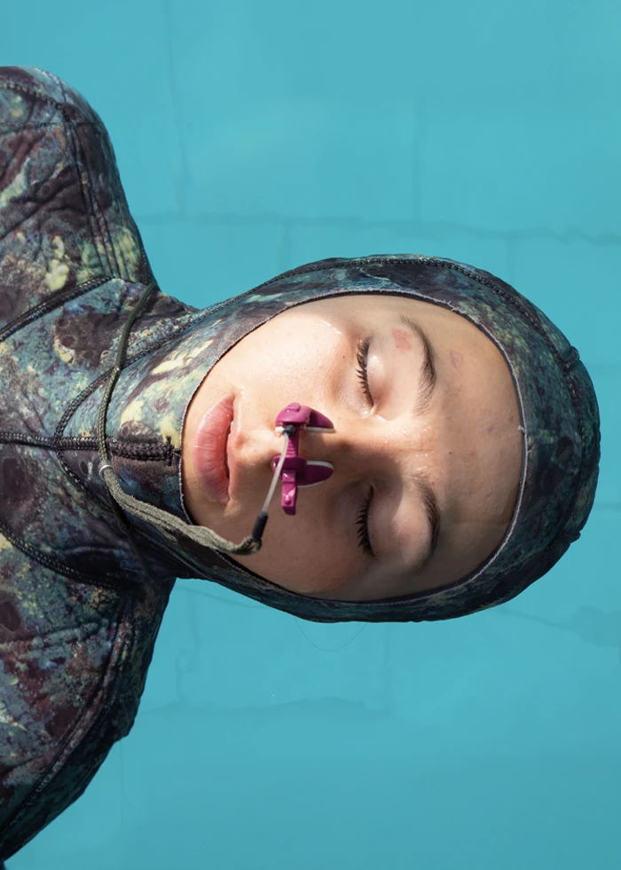
As part of their new visual identity, I redesigned and developed the website, art-directed a new photography library, and t-shirts and brochures . Creating a consistent look and putting their educational work at the heart of the brand.

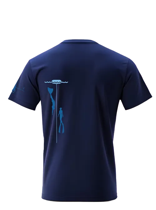
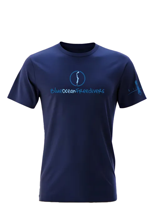
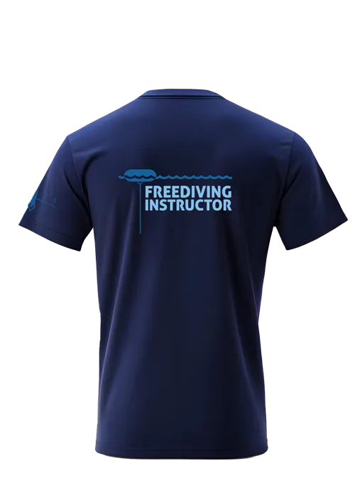

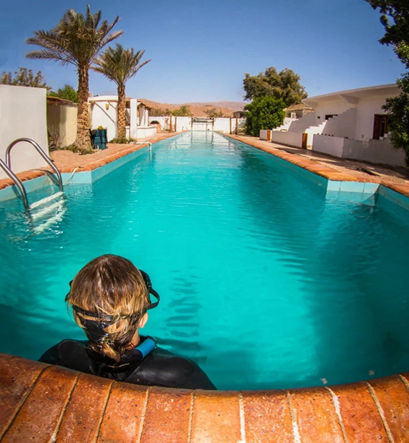
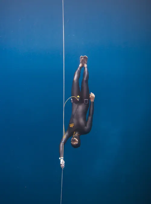


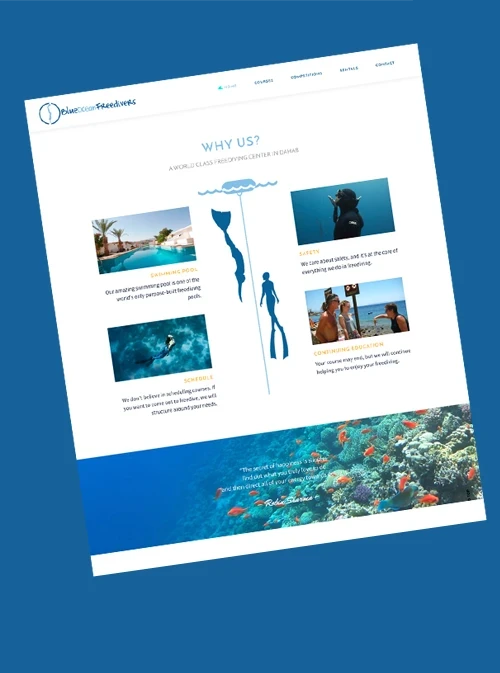
The new website makes courses easier to explore, with a stronger focus on instructor training and the Instructor Internship. I also developed a pool rental system that lets visitors check live availability and book online, simplifying the process for customers while reducing admin for the team.


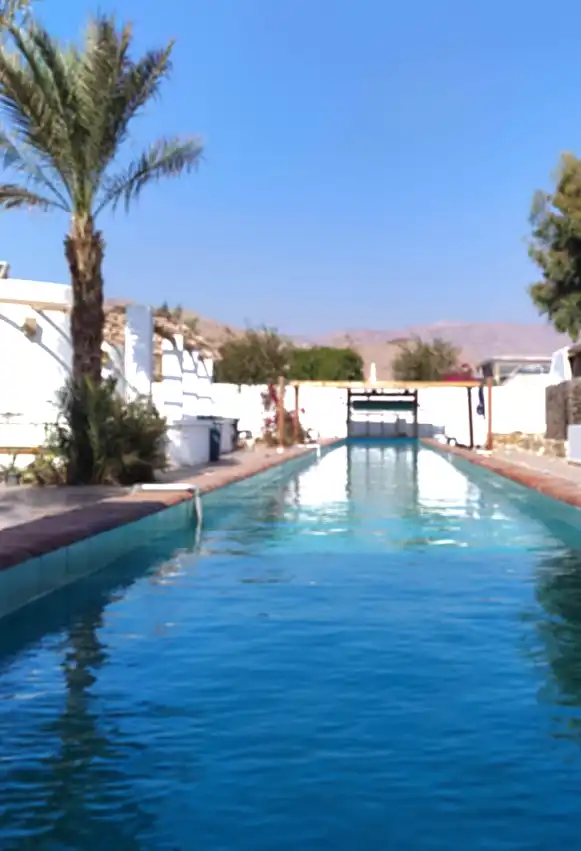
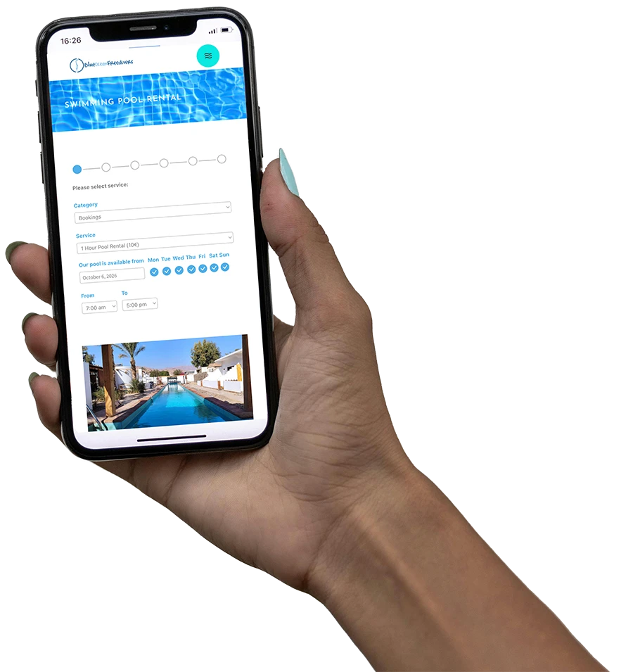
Swimming Pool Rental
More traffic → More bookings → Less admin
· Direct bookings
· Live availability
· Automated system
· Google Calendar sync
STRATEGY · UX · DESIGN · DEVELOPMENT

The website has greatly improved my time management. Renting the pool has been the biggest time-saver!
More Projects
Turning five iconic marine species into symbols of diving in Dahab

Crafting a brand around a passion for beer
Creating a visual identity that goes as deep as freediving


" width="534.9999834473942px"><path d="M 339.433 0 L 357.266 0 L 357.266 53.041 C 357.266 58.693 356.367 64.2 354.119 69.418 C 350.972 76.519 345.727 81.591 338.683 85.069 C 334.188 87.243 329.392 88.547 324.447 89.272 C 319.801 89.852 315.155 90.141 310.51 89.707 C 303.017 89.272 295.674 87.533 289.23 83.62 C 282.936 79.852 278.44 74.49 275.892 67.679 C 274.094 63.041 273.494 58.259 273.494 53.331 L 273.494 0 L 291.328 0 L 291.328 51.592 C 291.328 55.07 291.627 58.404 292.676 61.592 C 294.325 66.519 297.622 69.852 302.267 72.171 C 306.913 74.635 311.859 75.214 317.104 74.925 C 320.401 74.925 323.548 74.2 326.545 73.041 C 333.438 70.287 337.784 65.505 338.983 58.404 C 339.433 55.94 339.732 53.476 339.732 50.868 L 339.732 0 Z M 17.683 88.692 L 0 88.692 L 0 0 L 17.683 0 L 17.683 40.433 C 17.683 40.433 17.683 40.723 17.833 40.868 C 17.833 40.868 18.133 40.868 18.133 40.723 C 18.732 40.143 19.182 39.419 19.782 38.839 C 28.623 28.115 37.465 17.391 46.157 6.666 C 47.955 4.637 49.604 2.464 51.402 0.435 C 51.402 0.435 51.852 0.145 52.151 0.145 L 71.783 0.145 C 60.394 14.057 49.154 27.97 37.765 41.882 C 52.451 57.534 67.137 73.041 81.973 88.692 L 59.794 88.692 C 59.345 88.692 59.045 88.692 58.745 88.257 C 54.099 83.33 49.304 78.403 44.658 73.475 C 39.263 67.823 34.018 62.316 28.623 56.809 C 25.176 53.186 21.73 49.563 18.133 45.94 C 17.983 45.795 17.833 45.505 17.683 45.361 L 17.534 45.361 L 17.534 88.692 Z M 227.338 88.692 L 209.804 88.692 L 209.804 13.478 L 177.734 13.478 L 177.734 0 L 259.258 0 L 259.258 13.333 L 227.338 13.333 L 227.338 88.547 Z M 517.317 88.692 L 535 88.692 L 535 0 L 517.317 0 L 517.317 40.433 C 517.317 40.433 517.317 40.723 517.167 40.868 C 517.167 40.868 516.867 40.868 516.867 40.723 C 516.267 40.143 515.818 39.419 515.368 38.839 C 506.527 28.115 497.685 17.391 488.993 6.666 C 487.195 4.637 485.546 2.464 483.748 0.435 C 483.598 0.435 483.298 0.145 482.999 0.145 L 463.367 0.145 C 474.756 14.057 486.146 27.97 497.385 41.882 C 482.699 57.534 468.013 73.041 453.176 88.692 L 475.356 88.692 C 475.805 88.692 476.105 88.692 476.405 88.257 C 481.05 83.33 485.846 78.403 490.492 73.475 C 495.887 67.823 501.132 62.316 506.527 56.809 C 509.973 53.186 513.57 49.563 517.017 45.94 C 517.167 45.795 517.317 45.505 517.466 45.361 L 517.616 45.361 L 517.616 88.692 Z" fill="rgb(255, 255, 255)" height="89.91596792381937px" id="cDKCZwHz5" width="534.9999834473942px"/><path d="M 298.971 71.881 L 302.867 63.041 L 322.648 18.695 L 341.98 62.461 L 346.176 71.881 L 354.119 88.692 L 370.754 88.692 L 331.34 0 L 313.957 0 L 274.543 88.692 L 291.178 88.692 Z M 24.427 71.881 L 28.324 63.041 L 48.105 18.695 L 67.437 62.461 L 71.633 71.881 L 79.576 88.692 L 96.21 88.692 L 56.797 0 L 39.413 0 L 0 88.692 L 16.634 88.692 Z" fill="rgb(249, 178, 23)" height="88.69218326009977px" id="NRMZdCACa" transform="translate(81.973 0)" width="370.7535121921583px"/></g></svg>)